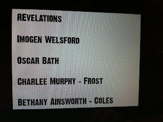
Yesterday myself and Charlee began to look at fonts to use for the titles. As we're making a horror-thriller I think it's good if we use a font which is fits in with this. A font that's quite large and masculine, therefore I think we should use a sans serif font so it appears masculine.
This was the first font which we looked at, I think this this would be a good choice as it's very similar to some other fonts in thrillers which I've looked at. I think the capitals are interesting as they stand out and make the font look masculine and powerful.
The second font we looked at is also quite spooky, the serifs make the font look like trees or sticks which makes it look scary but doesn't really fit in with the theme of our film. The fact that it's serif is another reason I don't really like this font is because it looks quite feminine which isn't conventional for a thriller film. Fonts in thrillers tend to be sans serif and quite bold and bright which this one isn't.
The third font which we looked at was this, it's very similar to the first one however I think that I prefer it as it's still sans serif and conventional for a thriller, however the letters are different heights which make it appear more interesting and appealing to look at.
Overall I think we should use the final font, 'Dirty Headline' however it's something which we'll need to decide on as a group.


No comments:
Post a Comment