The first film that I analysed was Frozen. I watched the opening 3 minutes of film and took notes on the important parts of the opening.
This film is about three young people, two boys and a girl, who go on a skiing holiday, only to find that they are stuck on a ski lift and have to decide whether to fight for their lives to get down from the lift, or to stay on the lift and freeze to death. I have discussed how lighting, sound and mise en scene is used to create a gripping thriller film. Frozen is a 2010 American Thriller, Horror film which was written and directed by Adam Green, starring Kevin Zegers, Shawn Ashmore and Emma Bell.
- The first shot I saw of the film was of the engine works for a ski lift, this was ominous because it shows it's very relevant to the film as it was the first part of the film that was shown. This created an ominous and dangerous tone as it was dark and there were loud noises coming from the lift, this created a negative tone. The diagetic sound in this scene creates a sinister tone as the grinding noises from the engines and the thunder create a suspense and keep the audience guessing about what is going to happen.
- After this there was a long shot of the mountains in the background which established the location, letting viewers know that they were skiing in the mountains, it also adds to the ominous tone as it links in with the danger of the control room.
- Straight after this was shown the setting changed to a bright, open spaced setting of one of the ski slopes, which then created a happier more positive tone as the bright colours and seeing loads of happy people in the background stepped away from the darkness and ominous tone. This has been done to grab the audiences attention and keep them interested and guessing about what will happen, the build up of danger and anticipation keeps viewers guessing and then when the scene changes it becomes more mysterious and viewers will be wondering what will happen.
- The characters were then introduced each with a close up; this shows viewers who the lead characters are and shows their facial expressions which are happy, reinforcing the positive, hopeful tone. Straight after the characters have been introduced they have a problem as they can't afford to buy tickets, this juxtaposes with positive tone which has just been created and creates another ominous tone as it suggests they will continue to have problems throughout the film.
- The beginning focus' on the fact that the characters can't afford to pay for the ski lift, this also adds to the ominous tone as it could be thought of as a warning as the characters end up getting stuck on the lift, and that is what the film is about. It's showing that the lift will always cause problems for them, and for viewers who know the story line or who have seen the trailer, they will know that the lift is dangerous.
- The mise en scene allows different moods and tones to be created throughout the film. For example, the dark lighting in the opening shot creates a sinister atmosphere, this contrasts with the bright sun light which is shown in the next scene which creates a more neutral tone. The costumes used allow viewers to understand what is happening, it works alongside establishing the setting- it makes the film look more realistic as the costumes are iconic as people associate the big coats, hats, goggles and skis with skiing.
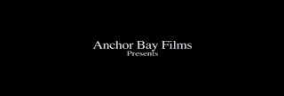
- The title sequence in Frozen has been kept simple which is very similar to the film itself as there aren't many settings or many characters in the film. The colours are all cool and neutral which is what the audience would expect from a film like this because it's set in a natural, and cold environment. The colours used also suggest that the movie will be depressing as they are mainly black and white which are dull, boring colours. A serif font has been used which makes the sequence look elegant and professional.

Researching this film has given me ideas about how the editing can keep viewers interested, as the beginning of the film cuts from the control room to the slope, changing from a negative tone to positive. I've also learned how sound and different settings can create different tones and add to viewers ideas about the film and their feelings.

No comments:
Post a Comment